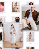
Have you ever stood in front of the mirror with that feeling that something in your outfit doesn't quite fit? You've combined your favourite blouse with those trousers you like so much, but the result is not what you expected... The good news is that there is a secret that stylists and Personal Shoppers use all the time: the colour wheel to combine clothes!
What is the colour wheel and why is it useful for matching clothes?
The colour wheel is a visual tool that organises colours according to their relationship to each other. It is made up of primary (red, blue and yellow), secondary (orange, green and violet) and tertiary colours, forming a circle that helps us understand how colours interact with each other.
In fashion, the colour wheel is key to creating harmonious and balanced combinations. It allows us to identify complementary colours (those that enhance each other, such as blue and orange), analogous (those that are together on the wheel and create soft and elegant looks) or monochromatic (variations of the same colour for a sophisticated style).
Using it will help you spice up your outfits and avoid unflattering combinations - it's the expert's secret to dressing with more confidence and style!
How to use the colour wheel to create perfect colour combinations
If you've ever doubted which colours go well together, the colour wheel is your best ally. This tool helps you choose harmonious and balanced combinations, no matter what your style is. Here we explain the main ways to combine clothes and colours in your wardrobe.
Basic colour combinations
1. Monochromatic 🩵💙
They consist of using different shades of the same colour. It is an elegant and sophisticated option, ideal for minimalist looks.
Example: A look entirely in shades of blue, such as a navy blazer, a light blue blouse, and mid-wash jeans.

2. Analogue 💜💙💚
They are created by combining colours that are next to each other on the colour wheel, creating harmony without too strong contrasts.
Example: A green top paired with accessories in turquoise tones.
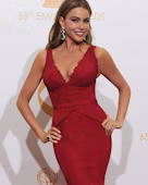
3. Supplementary ❤️💚 / 💙🧡
It's all about combining opposite colours on the wheel, which creates high contrast and vibrant, eye-catching looks.
Example: A cherry-coloured jumper with an olive green satin skirt, or a navy camisole top with orange trousers.
4. Triadic 💛💙❤️
These combinations use three equidistant colours on the wheel, creating a dynamic and balanced look.
Example: A look in yellow, blue and red – for instance, denim jeans, a red coat and a yellow jumper.
Colour chart for easy matching of clothes
To make your life easier, here's a colour and outfit matching chart with examples of outfits to inspire you:
| Type of combination | Colours | Outfit Examples |
|---|---|---|
| Monochromatic | Dark blue, medium blue, light blue | Navy blue suit + light blue shirt |
| Analogue | Green, blue-green, blue | Green blouse + blue trousers + aquamarine bag |
| Complementary | Red and green | Red dress + emerald green heels |
| Triadic | Yellow, blue and red | Yellow skirt + blue blouse + red bag |
Using the colour wheel will allow you to play with your clothes in a creative way and achieve balanced and stylish outfits. On this website, Adobe Color, you can generate colour palettes and colour charts to combine your clothes like an expert. Dare to experiment and find the combinations that best reflect your personality!
How to match clothing colours to suit your style and occasion
Not every colour works for every occasion. The key is to choose combinations that suit your style and the context in which you find yourself. Here we show you how to combine colours in your clothes and accessories according to the type of look you want to achieve.
Formal and elegant looks
For formal events, business meetings or sophisticated dinners, the key is to choose colours that convey elegance and professionalism.
➡ Neutral tones such as black, white, beige, grey and navy are a safe bet, as they work well both on their own and in combination with more vibrant colours.
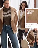
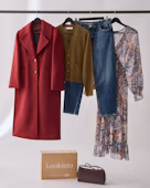
➡ Monochrome combinations are also ideal because they slim the silhouette and give a refined air, while deep, dark tones such as burgundy, emerald, navy or chocolate brown reinforce the sophistication of the look.
➡ A classic office look example is a monochromatic outfit with a blazer, shirt and trousers in matching neutral tones.
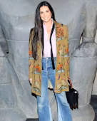
Casual and everyday outfits
For everyday wear, colour combinations can be more relaxed and versatile without losing style.
➡ Analogue colours are an excellent choice for those seeking harmony without too much contrast, while earth tones such as beige, brown, mustard and olive green create a natural and welcoming aesthetic.
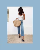
➡ Denim works as a neutral basic, allowing you to play with boldly coloured or printed tops effortlessly.
➡ A casual chic outfit might include a lilac jumper with a satin green skirt, while a relaxed yet super stylish combo could be a full denim look with green accessories.
Bold and trendy combinations
If you love to stand out with vibrant colours and play with fashion, bold combinations are the way to go.
➡ Complementary colours create bold and energetic contrasts, such as blue with orange or red with green, while triadic combinations balance the look by using three equidistant colours on the colour wheel, such as yellow, blue and red.
➡ Colour blocking is another trend that allows you to mix solid and contrasting tones in the same outfit for a modern and striking effect.
➡ A bold street style outfit could feature a coral blazer, a denim shirt, and trainers or yellow accessories.
If you want to start including bold colours in your wardrobe without taking too many risks, you can use them in accessories or on a key piece of clothing while maintaining a base of neutral tones. The most important thing is to experiment and find combinations that make you feel confident and fabulous.
Common mistakes when combining colours in clothing and how to avoid them
1️⃣ Using too many intense tones in the same look: This can visually saturate and take away harmony from the outfit. To avoid this, the best thing to do is to balance bright colours with neutral tones such as white, black, beige or grey, which help to give coherence to the outfit.
2️⃣ Avoiding colour altogether for fear of getting it wrong: This often leads to dull, unexpressive looks. A good way to start incorporating colour is to use it in accessories or in a single key garment.
3️⃣ Thinking that all shades of the same colour go well together: However, mixing the wrong undertones (cool or warm) can break visual harmony. Ideally, identify your colour scheme (which palette best suits your skin tone) and use it as a reference.
Finally, forgetting about visual balance can ruin even the best colour scheme. A simple and effective rule of thumb is to choose one main colour, one secondary colour and one accent colour for a stylish and purposeful look.
Learn to play with colours and create your own style
Next time you're wondering what to wear, remember that the colour wheel can be your best ally to create outfits with harmony and balance. Don't be afraid to experiment or try combinations you didn't dare to wear before. And if you need an expert hand to help you find the colours that suit you best, let our Personal Shoppers do it for you! At Lookiero, we select garments especially for you and help you get the most out of your wardrobe. Let us surprise you and add colour to your style!