The sun is shining, the days are getting longer – Spring 2026 is here! With rising temperatures comes a desire for fresh looks and vibrant nuances. But which Spring/Summer 2026 fashion colors will we actually see everywhere? From soft pastels to powerful statements: we take a look at the 2026 color trends and show you how to combine the new favorites with style.
What is the 2026 trend color according to Pantone?
Every year, fashion enthusiasts eagerly await the decision of the Pantone Color Institute. The 2026 trend color Pantone is more than just a shade – it sets the tone for the entire industry.
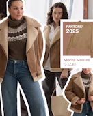
For 2026, "Cloud Dancer" (Pantone 11-4201) takes center stage. This clear, airy creamy white tone stands for clarity, new beginnings, and minimalist elegance. While we were enveloped in "Mocha Mousse" last year, the 2025 color of the year (updated to 2026 color of the year) becomes significantly lighter and more radiant.
Our Personal Shoppers love this tone because it works like a "canvas" – a noble backdrop that makes every other pop of color in the outfit truly shine.
Versatility: Cloud Dancer forms the perfect base for almost every look.
Calm: In a hectic world, this tone offers visual relaxation and high quality.
Combination Wonder: It can be perfectly mixed with all other bold 2026 color trends.
Which colors are trending in 2026?
Next to Pantone's radiant white, there are other major players on the runways from Paris to New York. The Pantone trend colors 2026 palette is complemented by energetic and natural tones.
At the forefront is a deep, almost mystical Transformative Teal, considered the new luxury alternative to navy blue. Those who like it more vivid cannot ignore the 2026 trend color Electric Fuchsia – a tone that gives every outfit an instant modern upgrade. For softer moments in spring, designers rely on Burnished Lilac, a smoky lilac that perfectly combines nostalgia and modernity. The palette is completed by warm, sunny accents in Amber Haze and the cool, refreshing Aquamarine.
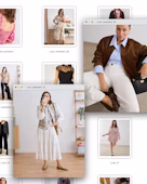
Spring/Summer 2026 fashion colors at a glance
Here is the practical overview from our experts for the coming season. These Spring/Summer 2026 fashion colors are the absolute key players:
1. Cloud Dancer (The New Cream-White)
The Color: Not a harsh pure white, but a soft, chalky creamy white. It looks luxurious, clean, and yet approachable.
Who does it suit? A true all-rounder. Cloud Dancer looks particularly radiant on Spring types and darker skin tones. For very pale skin (Summer type), our Personal Shoppers recommend wearing stronger makeup or a colorful accessory near the face.
Best Piece: A flowing pantsuit or a linen maxi dress.
Perfect Combination: Harmonious with all natural tones like beige, sand, or Shale Green. It looks very modern when mixed with gold jewelry.
Styling No-Go: Be careful when combining it with pure, bluish white – Cloud Dancer can quickly look "unwashed" or yellowish next to it. Better to stay within the creamy color family.
2. Burnished Lilac (Muted Lilac)
The Color: A dusty, almost smoky pastel tone. It is less "sweet" than classic pink and thus looks more grown-up and fashionable.
Who does it suit? An absolute highlight for the Summer type (light skin, ashy hair). The cool undertones of the color make blue and green eyes pop.
Best Piece: A pussy-bow blouse made of silk or a light cardigan for cool spring evenings.
Perfect Combination: Beautiful with cool silver jewelry. Great in combination with dark denim blue or a light grey. The brave wear it with Aquamarine.
Styling No-Go: Often clashes with warm earth tones like rust red or heavy orange. These colors take away the freshness of the lilac and make the look appear restless.
Here is the detailed expert analysis of the most important Spring/Summer 2026 fashion colors. Our Personal Shoppers have broken down what makes these nuances so special, who they suit, and how to avoid styling pitfalls.
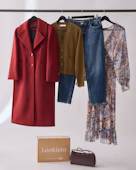
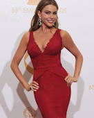
3. Lava Falls (Fiery Red)
The Color: A deep, saturated red with incredible presence. It is the "power color" of the 2026 color trends.
Who does it suit? Especially Winter types with dark hair and light eyes (the Snow White look) look stunning in it. The strong contrast of the color needs a face that doesn't fade beside it.
Best Piece: A statement coat or a lipstick in exactly this shade.
Perfect Combination: Classic and unbeatable with black or navy. For those who want to fully embrace the 2026 trend, combine Lava Falls with Cloud Dancer for a fresh contrast.
Styling No-Go: In combination with bright yellow, the look quickly resembles a uniform or a warning sign. Also, the combination with pink (color blocking) should be approached subtly and with great flair in 2026.

4. Shale Green (Soft Sage-Grey)
The Color: A muted green with a high grey component. It is reminiscent of moss and stone and radiates enormous calm.
Who does it suit? The ideal color for Autumn types with reddish or golden undertones in their hair. It looks noble and emphasizes a natural radiance.
Best Piece: Satin cargo pants or a structured blazer.
Perfect Combination: Harmonizes perfectly with warm brown tones, cognac leather, and the trend color Amber Haze. Copper or rose gold jewelry is the ideal fit here.
Styling No-Go: Too many neon colors destroy the natural elegance of Shale Green. Also, a very harsh, bluish violet often makes the green look "dirty."
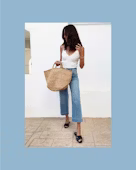
5. Aquamarine (Clear Glacier Blue)
The Color: A cool, almost transparent blue tone reminiscent of ice water or a clear summer sky. It looks refreshing and very modern.
Who does it suit? Summer and Winter types particularly benefit from the cool charisma. Those with light eyes will find that Aquamarine highlights them immediately.
Best Piece: A wide-cut poplin shirt blouse or a summery silk slip dress.
Perfect Combination: Looks fantastic with cool grey, navy, or as a fresh accent to Cloud Dancer. The bold combine it with metallic silver.
Styling No-Go: Warm, muddy brown tones often make Aquamarine look a bit "washed out." Better to stick with clear, cool contrasts.
6. Amber Haze (Golden Amber Yellow)
The Color: A warm, rich yellow-orange tone with a lot of depth. It radiates optimism and looks significantly softer than a garish lemon yellow.
Who does it suit? The absolute feel-good color for Spring and Autumn types. The golden undertone flatters a warm complexion and makes the skin look healthy and vibrant.
Best Piece: A structured knit sweater or a satin midi skirt that catches the light beautifully.
Perfect Combination: A dream in connection with Shale Green or dark denim. Gold jewelry is a must here to emphasize the warmth of the color.
Styling No-Go: Be careful with the combination with black – this often looks very harsh and quickly reminds one of a warning sign. Instead, reach for dark blue or anthracite.
7. Electric Fuchsia (Vibrant Pink-Violet)
The Color: A powerful, highly pigmented pink with a cool violet touch. It is the ultimate statement color of the Spring/Summer 2026 fashion colors.
Who does it suit? Above all, Winter types can wear this color wonderfully as they bring the necessary presence. But dark skin tones also look stunning in Electric Fuchsia.
Best Piece: A power blazer or a striking pair of high heels as a "pop of color."
Perfect Combination: For an elegant look, combine it with navy or dark grey. For the full trend, wear it with Cloud Dancer, which gives the pink a summery lightness.
Styling No-Go: Too many other pastel tones next to it can quickly make the look appear "childish." Electric Fuchsia needs clear edges and strong partners.
8. Transformative Teal (Deep Blue-Green)
The Color: A rich, dark turquoise that appears either blue or green depending on the light. It is the "intellectual" among the trend colors – profound, luxurious, and extremely calming.
Who does it suit? A true miracle for Autumn and Winter types. The depth of the color makes the skin look more even and makes brown and green eyes shine. Teal also has a neutralizing effect on facial redness.
Best Piece: An elegant pantsuit or a flowing satin blouse. It also looks fantastic as a knit dress for the transition period.
Perfect Combination: Our Personal Shoppers love the combination with Amber Haze (for an autumnal vibe) or classic Cloud Dancer for a maritime high-fashion look. Metallic tones like copper also fit excellently.
Styling No-Go: Avoid the combination with very bright neon colors. This takes away the teal's noble, deep effect and makes the outfit look restless.
2026 color trends: How to wear them
The new favorite 2026 trend color has been found, but how do you create a harmonious outfit? Our Personal Shoppers know: many women shy away from new nuances, but with a few professional tricks, it's quite simple.
The Type-Check: Who wears what?
Before new pieces land in your shopping cart, a look at the theory helps: What is colorimetry?. Colorimetry reveals why a cool Aquamarine makes a Summer type's complexion instantly look fresh, while a warm Amber Haze (golden yellow) makes the same type appear rather pale. The goal is to choose colors that support natural beauty instead of overpowering it.
Using the color wheel as a secret weapon
An indispensable tool for any styling is the color wheel for combining clothes. Once you understand it, there’s no more "guessing" when getting dressed—only pure style confidence. Here are further professional strategies to master the 2026 color trends using the color wheel:
Absolutely! For our Personal Shoppers, the color wheel is like a compass. Here is how you can use it:
1. Complementary Contrast (The Bold Statement)
This involves combining colors that are directly opposite each other on the color wheel. This creates maximum attention and energy.
The 2026 Combination: Mix Amber Haze (warm golden yellow) with a deep blue or Aquamarine.
Personal Shopper Tip: To ensure the look doesn't feel too shrill, work with proportions. For example, wear a dress in Aquamarine and set targeted accents with a clutch or sandals in Amber Haze.
2. Triadic Harmony (The High Art)
You choose three colors that form an equilateral triangle on the color wheel. This looks very lively yet balanced.
The 2026 Combination: A mix of Burnished Lilac, Amber Haze, and a soft turquoise tone (like a light Teal undertone).
Personal Shopper Tip: Choose one color as the main tone (e.g., trousers), the second as a complement (blouse), and the third only for details like jewelry or a print in a silk scarf.
3. Monochrome Minimalism (The Elegant Line)
Here, you stay within a single color family and vary only the brightness and saturation.
The 2026 Combination: A look entirely in green nuances—from a deep Transformative Teal to Shale Green and a very light pastel green.
Personal Shopper Tip: The key to success here is the mix of materials. Combine shiny satin trousers with a chunky knit sweater in the same shade. This gives the outfit depth, even without color contrasts.
4. The “Split-Complementary” Rule (The Harmonious Twist)
Instead of taking the direct opposite color, you choose the two colors to the right and left of the complementary color. This is less aggressive than a direct contrast but more exciting than simple harmony.
The 2026 Combination: Combine a top in Electric Fuchsia not with a direct green, but with a soft yellow (like Amber Haze) and a cool blue.
Personal Shopper Tip: This technique is ideal for patterned dresses or skirts. Make sure the colors in the pattern reflect this logic.
Pro Secret: The 60-30-10 Rule
When our Personal Shoppers put together an outfit in the Spring/Summer 2026 fashion colors, they often use this formula:
60% Main Color: Usually a neutral tone like Cloud Dancer (e.g., a suit or long dress).
30% Secondary Color: An accent like Burnished Lilac (e.g., a top or bag).
10% Accent Color: A small "shock" moment like Electric Fuchsia (e.g., lipstick, nail polish, or a delicate belt).

Your look, your colors
Our Personal Shoppers know: every woman is unique. From soft Pantone trend colors 2026 to the boldest Spring/Summer 2026 fashion color, the choice is huge.
Which 2026 trend color really suits you?
If you want to find out how the new colors look on you, Lookiero is the perfect solution. Take our Style Quiz and tell us about your preferences. Your Personal Shopper will analyze your type and select pieces that emphasize your natural radiance. Whether it's a key piece in the 2026 color of the year or relaxed leisure looks, we send a hand-picked selection to your home!